Space Map Visualizations
Animated Maps with country satellite information
Previously, we examined some trends in access to space: how many launches and what payloads were put in orbit lately. Now we’ll visualize some of that information in a map. We’ll use plotly choropleth Maps. Besides our space launch dataset, we will be using a list of country codes, available here with the full name of the country and the continent: in order to properly color a country in the map, we will need the country ISO code.
Note: throughout this post, many of the code needed to make it wor in an online notebook (such as Colab, Kagle or Azure) is ommited. The full notebook is available at github, and contains every cell needed to run the code. For simplicity, in some cases, where an interactive map is rendered, either an image or a gif is used instead.
import pandas as pd
import numpy as np
import matplotlib
import matplotlib.pyplot as plt
import seaborn as sns
import re
%matplotlib inline
!pip install chart-studio

import chart_studio.plotly as py
import plotly.graph_objs as go
from plotly.offline import download_plotlyjs, init_notebook_mode, plot, iplot
Collecting chart-studio
Downloading chart_studio-1.1.0-py3-none-any.whl (64 kB)
[K |████████████████████████████████| 64 kB 1.1 MB/s
[?25hRequirement already satisfied: requests in /opt/conda/lib/python3.7/site-packages (from chart-studio) (2.23.0)
Requirement already satisfied: six in /opt/conda/lib/python3.7/site-packages (from chart-studio) (1.14.0)
Requirement already satisfied: plotly in /opt/conda/lib/python3.7/site-packages (from chart-studio) (4.8.2)
Requirement already satisfied: retrying>=1.3.3 in /opt/conda/lib/python3.7/site-packages (from chart-studio) (1.3.3)
Requirement already satisfied: urllib3!=1.25.0,!=1.25.1,<1.26,>=1.21.1 in /opt/conda/lib/python3.7/site-packages (from requests->chart-studio) (1.24.3)
Requirement already satisfied: chardet<4,>=3.0.2 in /opt/conda/lib/python3.7/site-packages (from requests->chart-studio) (3.0.4)
Requirement already satisfied: idna<3,>=2.5 in /opt/conda/lib/python3.7/site-packages (from requests->chart-studio) (2.9)
Requirement already satisfied: certifi>=2017.4.17 in /opt/conda/lib/python3.7/site-packages (from requests->chart-studio) (2020.6.20)
Installing collected packages: chart-studio
Successfully installed chart-studio-1.1.0
init_notebook_mode(connected=True)
df = pd.read_csv("../input/spacelaunches/space_payloads.csv")
countries = pd.read_csv("../input/country-mapping-iso-continent-region/continents2.csv")

df.head()
| nation | operator | contractors | equipment | configuration | propulsion | power | lifetime | mass | orbit | ... | type | year | month | site_code | country | raw | details | name | second_nation | first_nation | |
|---|---|---|---|---|---|---|---|---|---|---|---|---|---|---|---|---|---|---|---|---|---|
| 0 | ussr | NaN | npo energia | 2 transmitters | pressurized sphere with four antennas | none | batteries | 21 days | 84 kg | 228 km × 947 km, 65.0� | ... | technology | 1957 | 10 | Ba-USSR | USSR / Russia | Ba= Baikonur (Tyuratam, NIIP-5, GIK-5), Tyuratam | orb | Baikonur (Tyuratam, NIIP-5, GIK-5), Tyuratam | NaN | ussr |
| 1 | ussr | NaN | NaN | NaN | r-7 core with added payload | none (after burnout) | batteries | 6 days | 508 kg (payload) | 212 km × 1660 km, 65.3� | ... | biological resaerch | 1957 | 11 | Ba-USSR | USSR / Russia | Ba= Baikonur (Tyuratam, NIIP-5, GIK-5), Tyuratam | orb | Baikonur (Tyuratam, NIIP-5, GIK-5), Tyuratam | NaN | ussr |
| 2 | usa | nasa | naval research laboratory (nrl) | NaN | NaN | none | solar cells, batteries | NaN | 1.5 kg | 654 km × 3969 km, 34.25� | ... | science | 1957 | 12 | CC | USA | CC= Cape Canaveral Air Force Station, Eastern... | orb | Cape Canaveral Air Force Station, Eastern Te... | NaN | usa |
| 3 | usa | nasa | jet propulsion laboratory (jpl) | cosmic-ray detection package, temperature sens... | aerodynimcally shaped satellite body attached ... | none | batteries | NaN | 14 kg (#1-3), 17 kg (#4-5) | 356 km × 2548 km, 33.24� (#1); 186 km × 2799 k... | ... | research, magnetosphere, micro meteorites | 1958 | 2 | CC | USA | CC= Cape Canaveral Air Force Station, Eastern... | orb | Cape Canaveral Air Force Station, Eastern Te... | NaN | usa |
| 4 | usa | nasa | naval research laboratory (nrl) | NaN | NaN | none | solar cells, batteries | NaN | 1.5 kg | 654 km × 3969 km, 34.25� | ... | science | 1958 | 2 | CC | USA | CC= Cape Canaveral Air Force Station, Eastern... | orb | Cape Canaveral Air Force Station, Eastern Te... | NaN | usa |
5 rows × 25 columns
As a quick reminder, the “nation” column contains the nation owner of the satellite launched, “country” stores the launch site’s country. “first_nation” and “second_nation” are used for satellites that belong to more than one country, or had their ownership transfered.
countries.head()
| name | alpha-2 | alpha-3 | country-code | iso_3166-2 | region | sub-region | intermediate-region | region-code | sub-region-code | intermediate-region-code | |
|---|---|---|---|---|---|---|---|---|---|---|---|
| 0 | Afghanistan | AF | AFG | 4 | ISO 3166-2:AF | Asia | Southern Asia | NaN | 142.0 | 34.0 | NaN |
| 1 | Åland Islands | AX | ALA | 248 | ISO 3166-2:AX | Europe | Northern Europe | NaN | 150.0 | 154.0 | NaN |
| 2 | Albania | AL | ALB | 8 | ISO 3166-2:AL | Europe | Southern Europe | NaN | 150.0 | 39.0 | NaN |
| 3 | Algeria | DZ | DZA | 12 | ISO 3166-2:DZ | Africa | Northern Africa | NaN | 2.0 | 15.0 | NaN |
| 4 | American Samoa | AS | ASM | 16 | ISO 3166-2:AS | Oceania | Polynesia | NaN | 9.0 | 61.0 | NaN |
Cleaning
First, time to clean our datasets. For easier comparisons, we’ll lowercase the country name.
countries["name"] = countries["name"].apply(lambda x : x.lower())
It’s necessary to make sure our country names are clean, and join our launch dataset with the country list. In order to do that, we start by looking for countries with unusual characters in their name (any non-letter).
df[ df["first_nation"].str.contains("[^a-z ]", regex=True)]
| nation | operator | contractors | equipment | configuration | propulsion | power | lifetime | mass | orbit | ... | type | year | month | site_code | country | raw | details | name | second_nation | first_nation | |
|---|---|---|---|---|---|---|---|---|---|---|---|---|---|---|---|---|---|---|---|---|---|
| 178 | u.k., usa | serc, nasa | westinghouse electric (spacecraft) | NaN | NaN | NaN | 4 deployable solar arrays, batteries | NaN | 62 kg (#1), 68 kg (#2) | 397 km × 1202 km, 53.86� (#1); 289 km × 1343 k... | ... | science | 1962 | 4 | CC | USA | CC= Cape Canaveral Air Force Station, Eastern... | orb | Cape Canaveral Air Force Station, Eastern Te... | usa | u.k. |
| 367 | u.k., usa | serc, nasa | westinghouse electric (spacecraft) | NaN | NaN | NaN | 4 deployable solar arrays, batteries | NaN | 62 kg (#1), 68 kg (#2) | 397 km × 1202 km, 53.86� (#1); 289 km × 1343 k... | ... | science | 1964 | 3 | WI | USA | WI= Wallops Flight Facility, Wallops Island, ... | orb | Wallops Flight Facility, Wallops Island, Vir... | usa | u.k. |
| 814 | u.k. | serc, nasa | british aircraft corp. | NaN | NaN | NaN | 4 deployable fixed solar arrays, batteries | NaN | 90 kg (#3); 100 kg (#4) | 496 km × 600 km, 80.17� (#3); 473 km × 589 km,... | ... | science | 1967 | 5 | Va | USA | Va= Vandenberg AFB, California | orb | Vandenberg AFB, California | NaN | u.k. |
| 1287 | ussr / russia | NaN | npo prikladnoi mekhaniki (npo pm) | NaN | NaN | NaN | solar cells, batteries | 6 months | 800 kg | NaN | ... | military communication, store dump | 1970 | 6 | Pl-USSR | USSR / Russia | Pl= Plesetsk (NIIP-53, GIK-1, GNIIP) | orb | Plesetsk (NIIP-53, GIK-1, GNIIP) | NaN | ussr / russia |
| 1307 | u.k. | royal aircraft establishment (rae) | royal aircraft establishment (rae) | NaN | sphere | none | none | NaN | 13.6 kg | 350 km × 1000 km, 82� (planned) | ... | technology | 1970 | 9 | Wo | Australia | Wo= Woomera Instrumented Range, Woomera, Sout... | orb | Woomera Instrumented Range, Woomera, South A... | NaN | u.k. |
| ... | ... | ... | ... | ... | ... | ... | ... | ... | ... | ... | ... | ... | ... | ... | ... | ... | ... | ... | ... | ... | ... |
| 9065 | ? | ? | ? | ? | NaN | NaN | none | NaN | NaN | NaN | ... | ballast | 2018 | 12 | Vo | USSR / Russia | Vo= Vostochniy, Amurskaya Oblast' | orb | Vostochniy, Amurskaya Oblast' | NaN | ? |
| 9066 | ? | ? | ? | ? | cubesat (6u) | NaN | none | NaN | NaN | NaN | ... | ballast | 2018 | 12 | Vo | USSR / Russia | Vo= Vostochniy, Amurskaya Oblast' | orb | Vostochniy, Amurskaya Oblast' | NaN | ? |
| 9067 | ? | ? | ? | ? | cubesat (6u) | NaN | none | NaN | NaN | NaN | ... | ballast | 2018 | 12 | Vo | USSR / Russia | Vo= Vostochniy, Amurskaya Oblast' | orb | Vostochniy, Amurskaya Oblast' | NaN | ? |
| 9068 | ? | ? | ? | ? | cubesat (6u) | NaN | none | NaN | NaN | NaN | ... | ballast | 2018 | 12 | Vo | USSR / Russia | Vo= Vostochniy, Amurskaya Oblast' | orb | Vostochniy, Amurskaya Oblast' | NaN | ? |
| 9116 | usa (#8, 10); usa, multinational (#9) | us air force (usaf) → us space force (ussf) | boeing | upgraded cross-band (x-band, global broadcast,... | bss-702 | r-4d-15 hipat, 4 × xips-25 ion engines | 2 deployable solar arrays, batteries | 14 years | 5987 kg | geo | ... | communication | 2019 | 3 | CC | USA | CC= Cape Canaveral Air Force Station, Eastern... | orb | Cape Canaveral Air Force Station, Eastern Te... | multinational | usa ; usa |
1127 rows × 25 columns
Taking a look at the first_nation and second_nation colums, some contain several countries. Some satellites are jointly opperated. Others may have changed ownership while in orbit.
df[ df["first_nation"].str.contains("[^a-z ]", regex=True)]["first_nation"].value_counts().tail(30)
ussr / russia              1066
u.k.                         19
usa  / monaco                10
ussr / russia / ukraine       8
usa ; usa                     7
usa / europe                  4
?                             4
usa / canada                  2
france ; azerbaijan           2
russia / ukraine              2
germany / usa                 2
usa / international           1
Name: first_nation, dtype: int64
To fix this, we use a mask, and split the nation column by any of those characters. Any country after a non-letter character we will send to the “second_country” column. The UK will be handled separately.
mask_uk =  df["first_nation"].str.contains("u.k.")
df.loc[ mask_uk, "first_nation"] = "uk"
mask =  df["first_nation"].str.contains("[^a-z ]", regex=True)
df.loc[ mask, "second_nation"] = df[mask]["first_nation"].apply(lambda x: re.split("[^a-z ]",x)[1].strip())
df.loc[ mask, "first_nation"] = df[mask]["first_nation"].apply(lambda x: re.split("[^a-z ]",x)[0].strip())

df["first_nation"] = df["first_nation"].str.strip()
df["second_nation"] = df["second_nation"].str.strip()
Now, how many countries are used in the “first_country” column of the dataset, and are absent in the country list?
def unmatched_codes(launch_site_codes,site_codes):
    unmatched_code_list = list(set(launch_site_codes)-set(site_codes))
    return unmatched_code_list
unmatched_codes(df["first_nation"],countries["name"])
['',
 'czechoslovakia',
 'usa',
 'ussr',
 'international',
 'uk',
 'europe',
 'north korea']
Several countries are not in the list. We’ll replace the values for USA and the UK, and consider the USSR as Russia. We’ll also fix czechoslovakia and North Korea. For satellites that mark their nation as International or Europe, we’ll do nothing for the time being. Remember our goal is to visualize the access to space in a map, as the years go by.
After some review of our dataset, the “countries” csv seems to have a mistake: country code “KP” is listed as north korea but should be south korea. We’ll fix this as well.
print(countries[ countries["name"].str.contains("korea") ])
print(countries[ countries["name"].str.contains("czech") ])

df["first_nation"].replace(to_replace={"uk":"united kingdom","usa":"united states","czechoslovakia":"czech republic","ussr":"russia"}, inplace=True)

korea_mask = countries["name"].str.contains("south korea")
skorea_mask = countries["name"].str.contains("korea, republic of")
countries.loc[korea_mask,"name"] = "north korea"
countries.loc[skorea_mask,"name"] = "south korea"
unmatched_codes(df["first_nation"],countries["name"])
                   name alpha-2 alpha-3  country-code     iso_3166-2 region  \
118         south korea      KP     PRK           408  ISO 3166-2:KP   Asia
119  korea, republic of      KR     KOR           410  ISO 3166-2:KR   Asia

       sub-region intermediate-region  region-code  sub-region-code  \
118  Eastern Asia                 NaN        142.0             30.0
119  Eastern Asia                 NaN        142.0             30.0

     intermediate-region-code
118                       NaN
119                       NaN
              name alpha-2 alpha-3  country-code     iso_3166-2  region  \
59  czech republic      CZ     CZE           203  ISO 3166-2:CZ  Europe

        sub-region intermediate-region  region-code  sub-region-code  \
59  Eastern Europe                 NaN        150.0            151.0

    intermediate-region-code
59                       NaN


['', 'international', 'europe']
Now we are ready to join! We’ll create a nations with payloads dataset, joining on the first_nation column.
Clean the “country” column as well
df["country"].value_counts().tail(30)
USSR / Russia       3872
USA                 3543
Kazakhstan           846
China                595
France               521
India                410
Japan                248
New Zealand           65
International         36
Iran                  13
Marshall Islands      12
Israel                10
Italy                  9
Australia              7
North Korea            5
Brazil                 4
Algeria                4
South Korea            3
Spain                  2
Name: country, dtype: int64
df["country"] = df["country"].apply(lambda x: re.split("[/]",x)[0].lower().strip())
df["country"].replace(to_replace={"uk":"united kingdom","usa":"united states","czechoslovakia":"czech republic","ussr":"russia"}, inplace=True)
df["country"].value_counts().tail(30)
russia              3872
united states       3543
kazakhstan           846
china                595
france               521
india                410
japan                248
new zealand           65
international         36
iran                  13
marshall islands      12
israel                10
italy                  9
australia              7
north korea            5
algeria                4
brazil                 4
south korea            3
spain                  2
Name: country, dtype: int64
unmatched_codes(df["country"],countries["name"])
['international']
nation_payloads_with_code = df.join(countries.set_index("name"), on="first_nation", lsuffix="payload_", rsuffix="country_",  how="right")
nation_payloads_with_code.describe()
| year | month | country-code | region-code | sub-region-code | intermediate-region-code | |
|---|---|---|---|---|---|---|
| count | 9863.000000 | 9863.000000 | 10034.000000 | 10033.000000 | 10033.000000 | 211.000000 |
| mean | 1996.196391 | 6.700193 | 658.758322 | 92.191169 | 86.967607 | 19.848341 |
| std | 19.066536 | 3.455433 | 213.353898 | 64.323316 | 75.288494 | 79.835758 |
| min | 1957.000000 | 1.000000 | 4.000000 | 2.000000 | 15.000000 | 5.000000 |
| 25% | 1980.000000 | 4.000000 | 643.000000 | 19.000000 | 21.000000 | 5.000000 |
| 50% | 1998.000000 | 7.000000 | 643.000000 | 142.000000 | 34.000000 | 11.000000 |
| 75% | 2015.000000 | 10.000000 | 840.000000 | 150.000000 | 151.000000 | 14.000000 |
| max | 2020.000000 | 12.000000 | 894.000000 | 150.000000 | 419.000000 | 830.000000 |
We seem to have missed some 200 launches (the count for year and region-code is different). Those may be because they are international launches, european, or the country code wasn’t registered. Being a bit sloppy, we’ll let that slide and go on with our map.
Plotting
What would we like to see first? First, a few tests to get Choropleth Maps working. Our final goal is an animated map with each passing month, and the space launches that took place at that time.
So we’ll begin by preparing our data. We’ll be using the period abstraction here to get the information summarized by month. A Period will represent the month and year the launch took place, and it is convenient since we can add and substract months from it easily. Remember the columns we had: alpha-3 has the country cide, year and month the moment of the launch. We are interested in those right now.
We’ll group by year, month, and country code, and count how many times a nation has put a payload in space in that period. As “date” we’ll keep the first one in the group, since any date will do for calculating the period.
We rename our columns, and create a new year-month column with the period abstraction.
nation_payloads_with_code.columns
Index(['nation', 'operator', 'contractors', 'equipment', 'configuration',
       'propulsion', 'power', 'lifetime', 'mass', 'orbit', 'date', 'id',
       'vehicle', 'site', 'failed', 'type', 'year', 'month', 'site_code',
       'country', 'raw', 'details', 'name', 'second_nation', 'first_nation',
       'alpha-2', 'alpha-3', 'country-code', 'iso_3166-2', 'region',
       'sub-region', 'intermediate-region', 'region-code', 'sub-region-code',
       'intermediate-region-code'],
      dtype='object')
#Use group by, and create a smaller dataframe with year, month of the launch, the country code, and the number of launches in that period for the selected country.
nations_per_month = nation_payloads_with_code.groupby( ["year","month","alpha-3"]).agg({"nation":"count","date":"first"}).reset_index().rename(columns={"nation":"payloads","alpha-3":"country"})
nations_per_month["year-month"] = pd.to_datetime(nations_per_month["date"]).dt.to_period("M")
nations_per_month["month"] = nations_per_month["month"].astype(int)
nations_per_month["year"] = nations_per_month["year"].astype(int)

#The same, but grouping by year.
nations_per_year = nation_payloads_with_code.groupby( ["year","alpha-3"]).agg({"nation":"count"}).reset_index().rename(columns={"nation":"payloads","alpha-3":"country"})
nations_per_month
#nations_per_year.groupby( ["year"]).agg({"country":"first"}).size().reset_index().rename(columns={0:"payloads","alpha-3":"country"})
/opt/conda/lib/python3.7/site-packages/pandas/core/arrays/datetimes.py:1104: UserWarning:

Converting to PeriodArray/Index representation will drop timezone information.
| year | month | country | payloads | date | year-month | |
|---|---|---|---|---|---|---|
| 0 | 1957 | 10 | RUS | 1 | 1957-10-04 03:00:00+00:00 | 1957-10 |
| 1 | 1957 | 11 | RUS | 1 | 1957-11-03 03:00:00+00:00 | 1957-11 |
| 2 | 1957 | 12 | USA | 1 | 1957-12-06 03:00:00+00:00 | 1957-12 |
| 3 | 1958 | 2 | USA | 2 | 1958-02-01 03:00:00+00:00 | 1958-02 |
| 4 | 1958 | 3 | USA | 3 | 1958-03-05 03:00:00+00:00 | 1958-03 |
| ... | ... | ... | ... | ... | ... | ... |
| 2619 | 2020 | 5 | RUS | 1 | 2020-05-22 03:00:00+00:00 | 2020-05 |
| 2620 | 2020 | 5 | USA | 5 | 2020-05-17 03:00:00+00:00 | 2020-05 |
| 2621 | 2020 | 6 | AUS | 1 | 2020-06-13 03:00:00+00:00 | 2020-06 |
| 2622 | 2020 | 6 | CHN | 5 | 2020-06-10 03:00:00+00:00 | 2020-06 |
| 2623 | 2020 | 6 | USA | 133 | 2020-06-04 03:00:00+00:00 | 2020-06 |
2624 rows × 6 columns
Now, in order to display our map we’ll use choropleth maps, from plotly. The code should be easy to understand, and we won’t cover how to use the library. The documentation is extensive and should help making sense of the code.
We need to build a layout, and our data. In our layout, we’ll define the type of projection we want for our map (mercator, in this case), and the title of our plot. In the data, we’ll specify how to interpret our dataframe. We’ll use only the first month. We need to specify where to get the locations to plot in the map (in this case, country codes), in the location key of the data dictionary. z is the value we want to “paint” that location with. In our case, the number of launches. Colorbar and Colorscale will affect how the color bar is displayed next to the map.
import chart_studio.plotly as py
import plotly.graph_objs as go
from plotly.offline import download_plotlyjs, init_notebook_mode, plot, iplot
import plotly.io as pio

init_notebook_mode(connected=False)

first_month = nations_per_month.loc[0].to_frame().transpose()

data = dict(
        type = 'choropleth',
        locations = first_month["country"],
        z = first_month["payloads"],
        text = first_month["payloads"],
         marker = dict(line = dict(color = 'rgb(255,255,255)',width = 1)),
        colorbar = {
            'title' : 'Number of payloads in orbit for the month',
            'x' : 1.2
        },
        colorscale= 'Viridis',
      )

layout = dict(
    title = dict(text = 'Satellites put to space in ' + str(first_month.loc[0]["month"]) + '/'+ str(first_month.loc[0]["year"]),
                x = 0.5),
    geo = dict(
        showframe = False,
        projection = {'type':'mercator'}
    ),
    legend = dict(
    xanchor = "left",
    yanchor = "bottom"),
    width = 1000,
    height = 700

)

choromap = go.Figure(data = [data],layout = layout)
iplot(choromap, animation_opts={'frame': {'duration': 100}} )
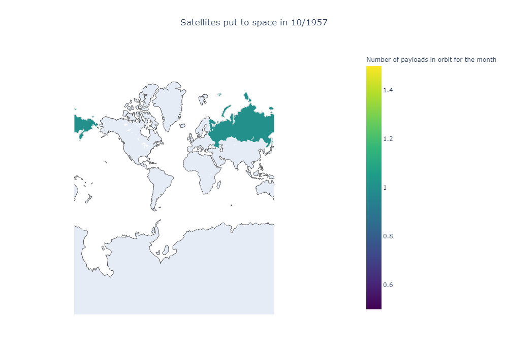
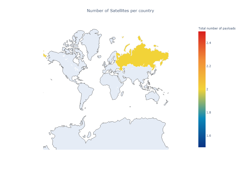
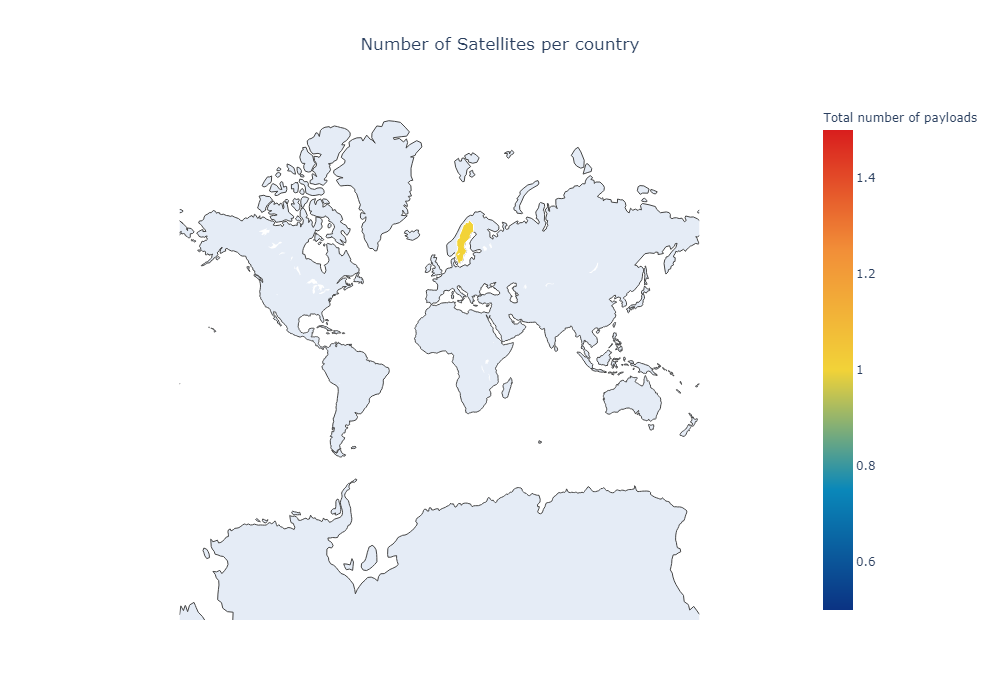
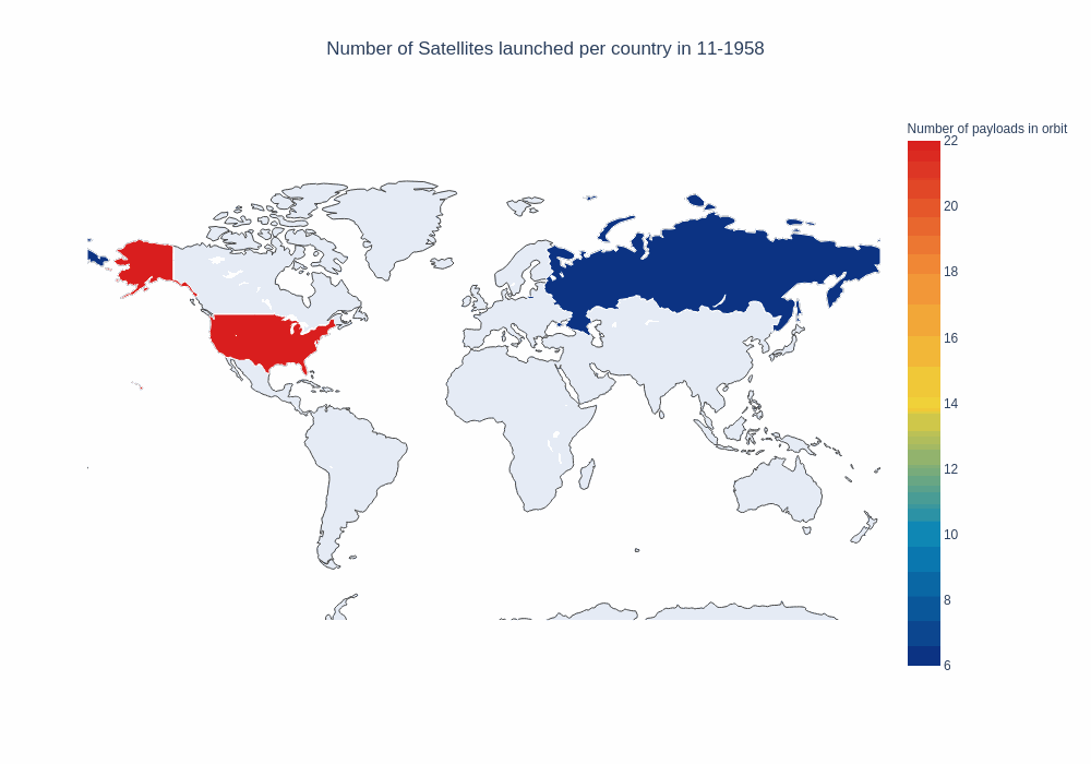
It works! It’s not very pretty, but it works. We only displayed the data for the first month in our dataset, in 1957, with the USSR (which we renamed to Russia) launching their first satellite. we’ll do a second test now, trying to animate a plot with different frames. There are several ways. We’ll be passing several “frames” to the Figure object we build, in this case the 1400th month in our dataframe, and two months after that.
first_frame = nations_per_month.loc[1400].to_frame().transpose()
second_frame = nations_per_month.loc[1401].to_frame().transpose()
third_frame = nations_per_month.loc[1402].to_frame().transpose()

data = dict(
        type = 'choropleth',
        locations = first_frame["country"],
        z = first_frame["payloads"],
        text = first_frame["payloads"],
         marker = dict(line = dict(color = 'rgb(255,255,255)',width = 1)),
        colorbar = {'title' : 'Total number of payloads'},
                colorscale= 'Portland',

      )

data2 = dict(
        type = 'choropleth',
        locations = second_frame["country"],
        z = second_frame["payloads"],
        text = second_frame["payloads"],
         marker = dict(line = dict(color = 'rgb(255,255,255)',width = 1)),
        colorbar = {'title' : 'Total number of payloads'},
                colorscale= 'Portland',

      )
data3 = dict(
        type = 'choropleth',
        locations = third_frame["country"],
        z = third_frame["payloads"],
        text = third_frame["payloads"],
         marker = dict(line = dict(color = 'rgb(255,255,255)',width = 1)),
        colorbar = {'title' : 'Total number of payloads'},
                colorscale= 'Portland',

      )

layout = dict(
   title = dict(text = 'Number of Satellites per country ',
                x = 0.5),
    geo = dict(
        showframe = False,
        projection = {'type':'mercator'}
    ),
    width = 1000,
    height = 700,
     legend = dict(
    xanchor = "left",
    yanchor = "bottom")
)

#If we wanted an interactive plot, we would use iplot like this. For demonstration purposes, we'll plot each frame separately.
#https://plotly.com/python/getting-started-with-chart-studio/
#choromap_multi = go.Figure(data = [data],layout = layout, frames=[
#    go.Frame({'data': data2}),
#    go.Frame({'data':data3}),{'layout':dict(
#    title = 'Second Test',
#    geo = dict(
#        showframe = False,
#        projection = {'type':'mercator'}
#    )
#    , updatemenus=[dict(
#            type="buttons",
#            buttons=[dict(label="Play",
#                          method="animate",
#                          args=[None])])]
#
#)}])
#iplot(choromap_multi, animation_opts={'frame': {'duration': 100}} )

iplot(go.Figure(data=[data],layout=layout))
iplot(go.Figure(data=[data2],layout=layout))
iplot(go.Figure(data=[data3],layout=layout))
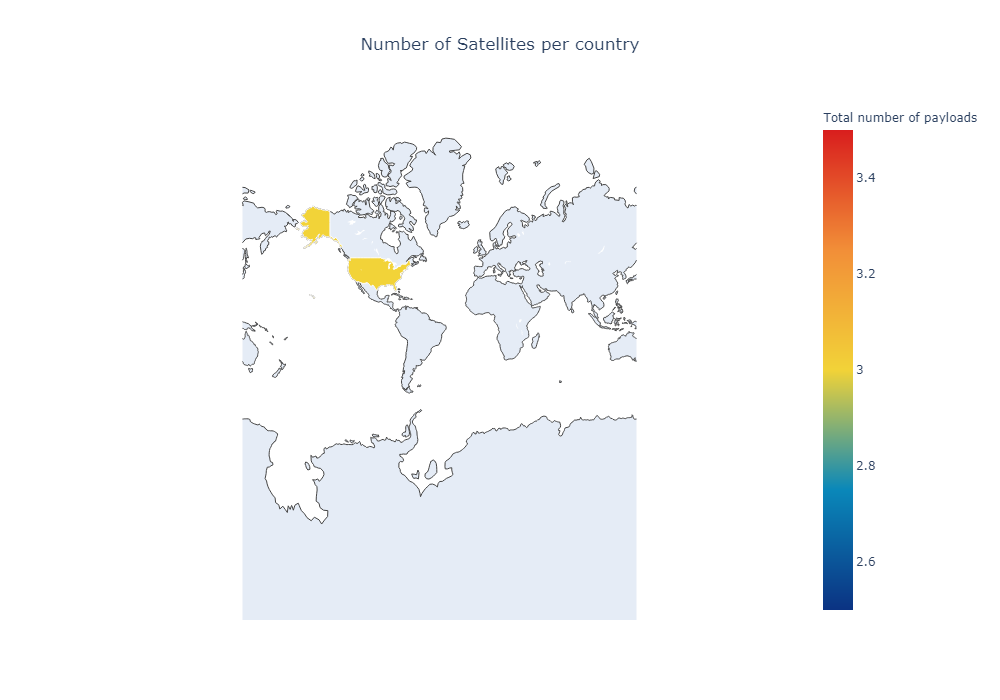
The problem with this approach is each frame only shows a single month. It’s hard to see a trend if we only visualize what countries launch any given month. It would be better to see thes results accumulate over time, and instead of each of our frames displaying how many satellites were launched at a given months, show instead how much satellites has a given country put to space up to that point.
To build the data we need, first we find all the rows before a given year, group by country, and then sum. For instance:
rows_1 = nations_per_month[ (nations_per_month["year"]<1960) ].groupby("country").agg({"payloads":"sum","year":"last"})
rows_2 = nations_per_month[ (nations_per_month["year"]<1961) ].groupby("country").agg({"payloads":"sum","year":"last"})
print(rows_1.reset_index())
print(rows_2.reset_index())
  country  payloads  year
0     RUS        11  1959
1     USA        46  1959
  country  payloads  year
0     RUS        20  1960
1     USA        79  1960
But that’s not enough, since we also will be using the month. In each of our rows, we have the year and month a payload was launched, as our period. Using that, we can slice our dataset.
sample_period_dataframe = nations_per_month[ nations_per_month["year-month"]<=pd.Period("1959-1") ]
print(sample_period_dataframe)
print(sample_period_dataframe.groupby("country").agg({"payloads":"sum","year":"last"}))
    year  month country  payloads                       date year-month
0   1957     10     RUS         1  1957-10-04 03:00:00+00:00    1957-10
1   1957     11     RUS         1  1957-11-03 03:00:00+00:00    1957-11
2   1957     12     USA         1  1957-12-06 03:00:00+00:00    1957-12
3   1958      2     USA         2  1958-02-01 03:00:00+00:00    1958-02
4   1958      3     USA         3  1958-03-05 03:00:00+00:00    1958-03
5   1958      4     RUS         1  1958-04-27 03:00:00+00:00    1958-04
6   1958      4     USA         1  1958-04-29 03:00:00+00:00    1958-04
7   1958      5     RUS         1  1958-05-15 03:00:00+00:00    1958-05
8   1958      5     USA         1  1958-05-28 03:00:00+00:00    1958-05
9   1958      6     USA         1  1958-06-26 03:00:00+00:00    1958-06
10  1958      7     USA         2  1958-07-25 03:00:00+00:00    1958-07
11  1958      8     USA         7  1958-08-12 03:00:00+00:00    1958-08
12  1958      9     RUS         1  1958-09-23 03:00:00+00:00    1958-09
13  1958      9     USA         1  1958-09-26 03:00:00+00:00    1958-09
14  1958     10     RUS         1  1958-10-11 03:00:00+00:00    1958-10
15  1958     10     USA         2  1958-10-11 03:00:00+00:00    1958-10
16  1958     11     USA         1  1958-11-08 03:00:00+00:00    1958-11
17  1958     12     RUS         1  1958-12-04 03:00:00+00:00    1958-12
18  1958     12     USA         2  1958-12-06 03:00:00+00:00    1958-12
19  1959      1     RUS         1  1959-01-02 03:00:00+00:00    1959-01
20  1959      1     USA         1  1959-01-21 03:00:00+00:00    1959-01
         payloads  year
country
RUS             8  1959
USA            25  1959
We will now define a new function putting it all together. With the dataframe and some parameters, we’ll build the figure, data, and layout needed to plot. We’ll also make the map a bit smaller, hiding Antarctica.
def setup_map_plot(dataframe, start_year=1957,end_year=2020,  save_images=False, title = "Map"):
    projection = "miller"
    frames = []

    first_year = dataframe[ dataframe["year"]==start_year]

    base_layout = dict(
        title = 'Test',
        geo = dict(
            showframe = False,
            projection = {'type':projection}
        )

    )

    for i in range(start_year,end_year):
        for m in range(1,12):
            row =  dataframe[ dataframe["year-month"]<=pd.Period(str(i)+"-"+str(m)) ].groupby("country").agg({"payloads":"sum","year":"last"}).reset_index()

            layout = dict(
                title = dict(text = 'Number of Satellites launched per country in ' + str(m)+'-'+str(i),
                        x = 0.5),
                geo = dict(
                    showframe = False,
                    projection = {'type':projection},
                    lataxis = {"range":[-55,90]}
                ),
            width = 1000,
            height = 700,
             legend = dict(xanchor = "left",yanchor = "bottom")

            )

            data = dict(
                type = 'choropleth',
                locations = row["country"],
                z = row["payloads"],
                text = row["payloads"],
                 marker = dict(line = dict(color = 'rgb(255,255,255)',width = 1)),
                colorbar = {'title' : title},
                        colorscale= 'Portland',

              )
            frames.append(go.Frame({"data":data,"layout":layout}))
            if save_images:
                choro_save = go.Figure(data=[data], layout = layout)
                choro_save.write_image(title+"_"+str(i+m)+".png")

    frames.append({'layout':dict(
        title = '',
        geo = dict(
            showframe = False,
            projection = {'type':projection}
        )
        , updatemenus=[dict(
                type="buttons",
                buttons=[dict(label="Play",
                              method="animate",
                              args=[None])])]
    )})

    first_frame = dict(
        type = 'choropleth',
        locations = first_year["country"],
        z = first_year["payloads"],
        text = first_year["payloads"],
         marker = dict(line = dict(color = 'rgb(255,255,255)',width = 1)),
        colorbar = {
            'title' : title,
            'x' : 1.2
        },
                colorscale= 'Viridis',

      )


    return (frames, first_frame, layout)
frames, data, layout = setup_map_plot(nations_per_month, start_year=1958, end_year=1965, title = "Number of payloads in orbit");

choromap_multi = go.Figure(data=[data], layout = layout, frames=frames)

iplot(choromap_multi, animation_opts={'frame': {'duration': 100}} )
#pio.write_html(choromap, file='hello_world_2.html', auto_open=True)
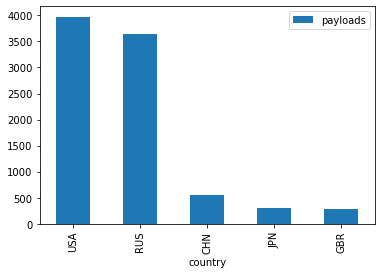
This is not too bad, but since Russia and the US account for a significant number of the launches, we can not really see any new trends emerging, for example in the last few years. If we take a look at the top 5 countries, we notice the imbalance.
nations_per_month.groupby("country").agg({"payloads":"sum"}).sort_values("payloads",ascending=False).head(5).plot(kind="bar")
<matplotlib.axes._subplots.AxesSubplot at 0x7fa365275910>
We’ll try solving this using a running average of the payloads in the last few years, and plot that. We’ll use a “sliding window” of valid periods, just using pd.Period + N, with N the number of months we’d like to consider.
starting_period = pd.Period("1970-1")
months = 12

print("12 month period since 1970")
print(nations_per_month[  ( nations_per_month["year-month"]>=starting_period ) & ( nations_per_month["year-month"]<=starting_period + months ) ].groupby("country").agg({"payloads":"sum","year":"last"}).reset_index())

#Now, we'll run this for 2 years, one month at a time, and get 24 different dataframes.

test_df = pd.DataFrame()

for i in range(12):
    period = starting_period + i
    tdf = nations_per_month[  ( nations_per_month["year-month"]>=period ) & ( nations_per_month["year-month"]<=period + months ) ].groupby("country").agg({"payloads":"sum","year":"last"}).reset_index()
    tdf["frame"] = i;
    test_df = test_df.append(tdf)

fig = plt.figure(figsize=(14,10))

fig = sns.lineplot(data=test_df,y="payloads",x="frame", hue="country")
12 month period since 1970
  country  payloads  year
0     AUS         1  1970
1     CHN         1  1970
2     DEU         2  1970
3     FRA         1  1970
4     GBR         3  1970
5     JPN         2  1970
6     RUS        90  1971
7     USA        36  1971
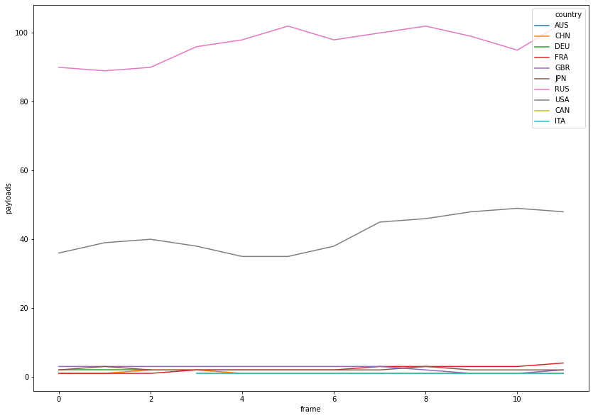
There’s still a big difference, but we’ll modify our function and see how that works out. We’ll be passing the portion of code that creates the frame as a callback, in order to test several window sizes. And, as you might have noticed, the scale varies wildly from one moment to the other. That’s not useful, so we’ll fix the minimum and maximum values of z, checking the global max when we compute our data.
Furthermore, in order to deal with the large difference in values from our scale, we won’t use a continuous color map, but segment our scale conviniently to have the smallest values use a different color.
To do this, we compute the smallest value in our set of data, and map that value to a 0-1 scale. (the input for the color scale is an array [0 to 1, [rgb] ]. So any value below 0.9 (we’ll see why later on) will be the lowest “threshold” in our scale, and we’ll paint that gray. From there, we’ll use a green -> blue color scale. It goes from [0,255,0] to [0,255,255], and then removes green to have only blue in the higher values: [0,0,255]
That scale won’t be linear, however: the lowest 20% will account for most of our color values. Once a country is above a certain threshold, we don’t really care about the difference The upper 80% we’ll then have most of the higher, “only blue” values.
def setup_map_plot(dataframe, frame_calculation, start_year=1957,end_year=2020, chart_title = "Title", title = "Map", filename="map", save_images=False, **kwargs):
    projection = "miller"
    frames = []

    first_year = dataframe[ dataframe["year"]==start_year]

    base_layout = dict(
        title = 'Test',
        geo = dict(
            showframe = False,
            projection = {'type':projection}
        )

    )

    z_min = 0;
    z_max = 0;

    rows = [frame_calculation(dataframe,i,m,extra_args=kwargs) for i in range(start_year,end_year) for m in range(1,12)]

    for i in range(start_year,end_year):
        for m in range(1,12):
            row =  frame_calculation(dataframe,i,m,extra_args=kwargs)
            z_max = max(z_max,row["payloads"].max())


    data = dict(
        type = 'choropleth',
        locations = first_year["country"],
        z = first_year["payloads"],
        zmax = z_max,
        text = first_year["payloads"],
         marker = dict(line = dict(color = 'rgb(255,255,255)',width = 1)),
        colorbar = {'title' : title},
                colorscale= 'Wistia',

      )
    layout = dict(
        title = dict(text = chart_title,
                x = 0.5),
        geo = dict(
            showframe = False,
            projection = {'type':projection},
            lataxis = {"range":[-55,90]}
        ),
    width = 1000,
    height = 700,
     legend = dict(xanchor = "left",yanchor = "bottom")

    )

    z_range = (z_max-z_min)

    for i,row in enumerate(rows):
        data = dict(
                type = 'choropleth',
                locations = row["country"],
                z = row["payloads"],
                zmax = z_max,
                zmin = z_min,
                text = row["payloads"],
                 marker = dict(line = dict(color = 'rgb(255,255,255)',width = 1)),
                colorbar = {'title' : title,'x':1.2},
                colorscale = "portland",

              )

        layout["title"]["text"] = chart_title + str((1+i)%12)+'-'+str( (start_year)+(i//12) )
        frames.append(go.Frame({"data":data,"layout":layout}))

        if save_images:
            choro_save = go.Figure(data=[data], layout = layout)
            choro_save.write_image(str(i)+"_gif_"+filename+".png")

    frames.append({'layout':dict(
        title = title,
        geo = dict(
            showframe = False,
            projection = {'type':projection}
        )
        , updatemenus=[dict(
                type="buttons",
                buttons=[dict(label="Play",
                              method="animate",
                              args=[None])])]
    )})


    return (frames, data, layout)
These are the functions that will create the rows to plot in our map. To make it more usable later, we’ll allow the target column (the one we’ll sum) as a parameter
def cummulative_rows(dataframe,year,month, extra_args):
    rows =  dataframe[ dataframe["year-month"]<=pd.Period(str(year)+"-"+str(month)) ].groupby("country").agg({"payloads":"sum","year":"last"}).reset_index()
    return rows;

def running_average_rows(dataframe,year,month, extra_args):
    months = extra_args["months"]
    starting_period = pd.Period(str(year)+"-"+str(month))
    period = starting_period + months
    rows = dataframe[  ( dataframe["year-month"]>starting_period ) & ( dataframe["year-month"]<=period ) ].groupby("country").agg({"payloads":"sum","year":"last"}).reset_index()
    return rows;
window_size = 48

frames, data, layout = setup_map_plot(nations_per_month, running_average_rows, start_year = 2012, end_year = 2018,
                                      chart_title = 'Satellites belonging to each country launched in the ' + str(window_size) + " months after ",
                                      title="Satellites put in orbit last "+ str(window_size) + " months", filename="running_avg_4_years", save_images=False, months=window_size, column="payload");
choromap_multi = go.Figure(data=[data], layout = layout, frames=frames)


iplot(choromap_multi, animation_opts={'frame': {'duration': 500}} )
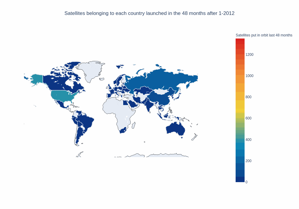
That’s pretty good. It would also be nice if our map could “remember” what countries have launched in the past, to be able to tell them apart from countries that haven’t launched yet. In order to do that, we’ll define a new function and pass it as a parameter for our map plot function: It’ll return the running average, but countries that have launched in the past will be included with “0.1” payloads.
months = 12
year = 2012
month = 4
starting_period = pd.Period(str(year)+"-"+str(month))
period = starting_period + months
rows_window = nations_per_month[  ( nations_per_month["year-month"]>starting_period ) & ( nations_per_month["year-month"]<=period ) ].groupby("country").agg({"payloads":"sum","year":"last"}).reset_index()
rows_cummulative = nations_per_month[  ( nations_per_month["year-month"]<=starting_period ) ].groupby("country").agg({"payloads":"sum","year":"last"}).reset_index()
rows_cummulative["payloads"] = 0.01
rows_window["payloads"] = rows_window["payloads"]*10
merged = rows_cummulative.merge(rows_window,how="outer",on="country",suffixes=("_window","_cummulative"))
merged = merged.fillna(0)
merged.head(10)
| country | payloads_window | year_window | payloads_cummulative | year_cummulative | |
|---|---|---|---|---|---|
| 0 | ARE | 0.01 | 2012.0 | 0.0 | 0.0 |
| 1 | ARG | 0.01 | 2011.0 | 10.0 | 2013.0 |
| 2 | AUS | 0.01 | 2009.0 | 0.0 | 0.0 |
| 3 | BLR | 0.01 | 2006.0 | 20.0 | 2012.0 |
| 4 | BRA | 0.01 | 2008.0 | 10.0 | 2012.0 |
| 5 | CAN | 0.01 | 2010.0 | 80.0 | 2013.0 |
| 6 | CHE | 0.01 | 2010.0 | 0.0 | 0.0 |
| 7 | CHL | 0.01 | 2011.0 | 0.0 | 0.0 |
| 8 | CHN | 0.01 | 2012.0 | 210.0 | 2013.0 |
| 9 | COL | 0.01 | 2007.0 | 0.0 | 0.0 |
To have our slice of dataframe ready, we’ll keep the larger value between the cummulative and the window values, for the “payloads” column.
merged["year"] = merged["year_window"].astype(int)
merged["payloads"] = merged[ ["payloads_cummulative","payloads_window"] ].max(axis=1)
merged = merged[ ["year","payloads","country"] ]
merged.head()
| year | payloads | country | |
|---|---|---|---|
| 0 | 2012 | 0.01 | ARE |
| 1 | 2011 | 10.00 | ARG |
| 2 | 2009 | 0.01 | AUS |
| 3 | 2006 | 20.00 | BLR |
| 4 | 2008 | 10.00 | BRA |
Putting it all together:
def running_average_with_memory_rows(dataframe,year,month, extra_args):
    months = extra_args["months"]
    starting_period = pd.Period(str(year)+"-"+str(month))
    period = starting_period + months
    rows_window = dataframe[  ( dataframe["year-month"]>starting_period ) & ( dataframe["year-month"]<=period ) ].groupby("country").agg({"payloads":"sum","year":"last"}).reset_index()
    rows_cummulative = dataframe[  ( dataframe["year-month"]<=starting_period ) ].groupby("country").agg({"payloads":"sum","year":"last"}).reset_index()
    rows_cummulative["payloads"] = 0.01
    merged = rows_cummulative.merge(rows_window,how="outer",on="country",suffixes=("_window","_cummulative"))
    merged = merged.fillna(0)
    merged["year"] = merged["year_window"].astype(int)
    merged["payloads"] = merged[ ["payloads_cummulative","payloads_window"] ].max(axis=1)
    return merged[ ["year","payloads","country"] ]
dec_2019_satellites = running_average_with_memory_rows(nations_per_month,2019,12,extra_args={'months': 12})
dec_2019_satellites.tail(10)
| year | payloads | country | |
|---|---|---|---|
| 68 | 2019 | 0.01 | SWE |
| 69 | 2019 | 0.01 | THA |
| 70 | 2019 | 0.01 | TWN |
| 71 | 2017 | 0.01 | UKR |
| 72 | 2014 | 0.01 | URY |
| 73 | 2019 | 447.00 | USA |
| 74 | 2017 | 0.01 | VEN |
| 75 | 2019 | 0.01 | VNM |
| 76 | 2018 | 0.01 | ZAF |
| 77 | 0 | 1.00 | GTM |
One extra thing: redifining the function to plot the log of the payloads: The vast majority of our values are between 0 and 20, with few above 100 and 400. With a logarithmic scale we’ll be able to visualize that information better. We’ll define a function to transform our payload, keeping our fake 0.01 value to signify past launches as 0, a single launch as log(1.1), and log of the number of payloads for the rest.
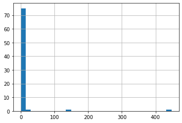
dec_2019_satellites["payloads"].hist(bins=30)
<matplotlib.axes._subplots.AxesSubplot at 0x7fa36540e810>
def transform_payload_count(count):
    if count == 0.01:
        return np.log10(1)
    elif count == 1:
        return np.log10(1.1)
    else:
        return np.log10(count)
dec_2019_satellites["payloads"].apply(transform_payload_count)
0     0.000000
1     0.000000
2     0.301030
3     0.041393
4     0.000000
        ...
73    2.650308
74    0.000000
75    0.000000
76    0.000000
77    0.041393
Name: payloads, Length: 78, dtype: float64
def setup_map_plot(dataframe, frame_calculation, start_year=1957,end_year=2020, chart_title = "Title", title = "Map", filename="map", save_images=False, **kwargs):
    projection = "miller"
    frames = []

    first_year = dataframe[ dataframe["year"]==start_year]

    base_layout = dict(
        title = 'Test',
        geo = dict(
            showframe = False,
            projection = {'type':projection}
        )

    )

    z_min = 0;
    z_max = 0;

    rows = [frame_calculation(dataframe,i,m,extra_args=kwargs) for i in range(start_year,end_year) for m in range(1,12)]

    for i in range(start_year,end_year):
        for m in range(1,12):
            row =  frame_calculation(dataframe,i,m,extra_args=kwargs)
            z_max = max(z_max,row["payloads"].apply(transform_payload_count).max())

    layout = dict(
        title = dict(text = chart_title,
                x = 0.5),
        geo = dict(
            showframe = False,
            projection = {'type':projection},
            lataxis = {"range":[-55,90]}
        ),
    width = 800,
    height = 600,
     legend = dict(xanchor = "left",yanchor = "bottom")

    )
    tick_values = [0,0.2,0.4,0.6,1]
    z_range = (z_max-z_min)
    #smallest_value = (0.9)/(z_range)
    smallest_value = 0.001
    print("factor is ", smallest_value)
    for i,row in enumerate(rows):
        data = dict(
                type = 'choropleth',
                locations = row["country"],
                z = row["payloads"].apply(transform_payload_count),
                zmax = z_max,
                zmin = z_min,
                text = row["payloads"],
                 marker = dict(line = dict(color = 'rgb(255,255,255)',width = 1)),
                colorbar = {'title' : title,'x':1.2,'tickmode': "array",
                            'tickvals': [tval * z_range for tval in tick_values],
                            'ticktext': [np.power(10,tval * z_range).astype(int) for tval in tick_values]
                           },
                colorscale = [[0, 'rgb(90,90,90, 0.5)'],
                      [smallest_value, 'rgb(90,90,90,0.5)'],
                      [smallest_value, 'rgb(0,255,0,0.5)'],
                      [0.5, 'rgb(0,255,255,0.5)'],
                      [1, 'rgb(0,0,255,0.5)'],
                     ],

              )

        layout["title"]["text"] = chart_title + str(1+(i)%12)+'-'+str( (start_year)+(i//12) )
        frames.append(go.Frame({"data":data,"layout":layout}))

        if save_images:
            choro_save = go.Figure(data=[data], layout = layout)
            choro_save.write_image(str(i)+"_gif_"+filename+".png")

    frames.append({'layout':dict(
        title = title,
        geo = dict(
            showframe = False,
            projection = {'type':projection}
        )
        , updatemenus=[dict(
                type="buttons",
                buttons=[dict(label="Play",
                              method="animate",
                              args=[None])])]
    )})


    return (frames, data, layout)
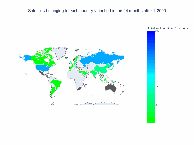
window_size = 24

frames, data, layout = setup_map_plot(nations_per_month, running_average_with_memory_rows, start_year = 1957, end_year = 2020,
                                      chart_title = 'Satellites belonging to each country launched in the ' + str(window_size) + " months after ",
                                      title="Satellites in orbit last "+ str(window_size) + " months",filename="running_avg_memory_2_years",save_images=False, months=window_size );
choromap_multi = go.Figure(data=[data], layout = layout, frames=frames)


iplot(choromap_multi, animation_opts={'frame': {'duration': 100}} )
Finally, we’ll create a gif from the output images, using our “save_images” parameters we’ll create a series of png files for each frame of our map, and combine for export. Some of the files can be a bit large!
!pip install Pillow
Requirement already satisfied: Pillow in /opt/conda/lib/python3.7/site-packages (7.2.0)
setup_map_plot(nations_per_month, running_average_with_memory_rows, start_year = 1957, end_year = 2020,
                                      chart_title = 'Satellites belonging to each country launched in the ' + str(window_size) + " months after ",
                                      title="Satellites in orbit last "+ str(window_size) + " months",filename="1_running_avg_memory_2_years",save_images=True, months=24 );

setup_map_plot(nations_per_month, running_average_rows, start_year = 1957, end_year = 2020,
                                      chart_title = 'Satellites belonging to each country launched in the ' + str(window_size) + " months after ",
                                      title="Satellites put in orbit last "+ str(window_size) + " months", filename="2_running_avg_2_years", save_images=True, months=24);
factor is  0.001
factor is  0.001
import glob
from PIL import Image

gif_1 = "1_running_avg_memory_2_years"
gif_2 = "2_running_avg_2_years"

'''Build a gif with all the images starting with the given prefix.
'''
def pngs_to_gif(file_prefix):
    # filepaths
    fp_in = "./*_gif_"+file_prefix+"*.png"
    fp_out = "gif_"+file_prefix+"_image.gif"

    # https://pillow.readthedocs.io/en/stable/handbook/image-file-formats.html#gif
    img, *imgs = [Image.open(f) for f in ["./"+f.split("_gif_")[0].replace("./","")+"_gif_"+file_prefix+".png" for f in sorted([f.split("_gif_")[0].replace("./","") for f in glob.glob(fp_in)], key=int) ] ]
    img.save(fp=fp_out, format='GIF', append_images=imgs,
             save_all=True, duration=200, loop=0)

pngs_to_gif(gif_1)
pngs_to_gif(gif_2)
I won’t post the final images here, since they need to be optimized in order to have a reasonable size.
With this notebook, we were able to visualize some of our space data. We get a better sense of the trend watching the number of countries that have satellites in orbit. The non linear scale helps to better represent every country, not only those that have a large number of satellites in orbit. This generic method of ploting (with a function creating each frame) gives us lots of flexibility to keep exploring this dataset. What could we try to answer next?
- We should have taken into account only successful launches, but that can be fixed quickly.
- Another questions we could start answering with our new visualizing capabilities is the raw tonnage of payloads in orbit. In order to do that, we need to keep cleaning our data, and use other columns.